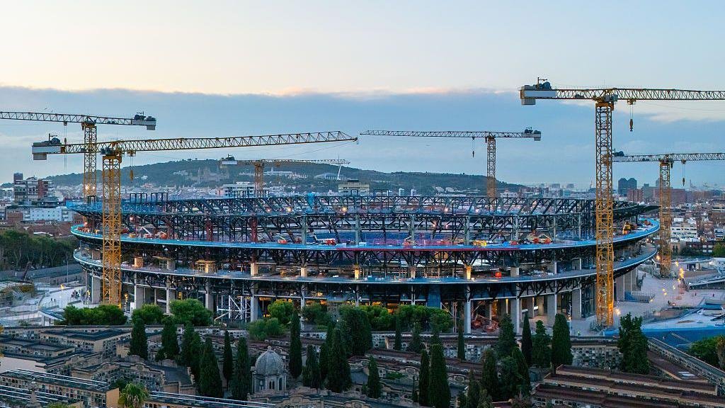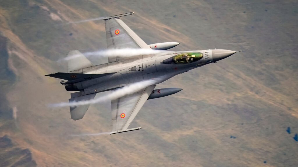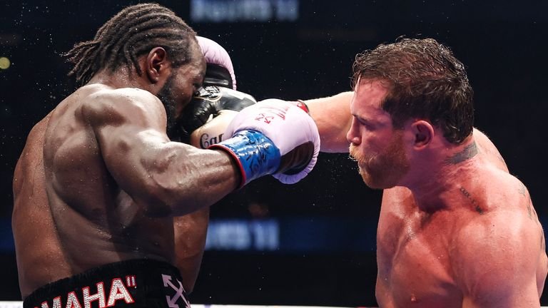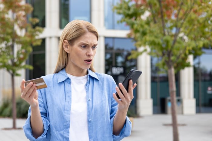
Many of my Advent of Patterns blog posts contain visuals that accompany the text. This is different from much of my previous writing which was text-focused; technical guides, poetry, musings.
When looking through my posts, I noticed that some of the details of the images were hard to grasp because they were too small. I was trying to fit the images in a container designed for text: a container whose maximum width was set to be most readable for text, without particular consideration for images.
This got me thinking: how can I make my blog images bigger so they are easier to read?
I decided to follow in the footsteps of the BBC and create a design that lets images be wider than the main content container, but only on the right side.

Letting the content grow only on the right side is important because I have a sidebar on the left side of the page. If the image was wider on both sides, the image may overlap with the sidebar. I love the pattern of making an image wider on both sides, but it works best on center-aligned text with plenty of space on either side. My website, on the other hand, uses two columns that are close together.
I had two requirements:
- The image should be wider on the right side, and;
- The minimum size for the image should be equal to the width of the text column.
I implemented this using the following CSS rule to img tags in my blog posts:
width: clamp(100%, 130%, 65vw);
The CSS clamp attribute lets you specify a minimum, preferred, and maximum value. The browser will then compute which value to use that matches those specifications. In this case, I say that I want images to :
- Have a minimum width of 100%. This means the maximum size of the content container, which is around 35rem.
- Have a preferred width of 130%. This allows the image to grow outside the container without getting too big.
- Have a maximum width of 65vw.
With this one rule, I can have images that are bigger than the parent container that scale at different resolutions.
The following video shows an image scaling as the browser is resized:
This change makes it much easier to see the details in images on bigger screens that were previously confined to a much smaller space.
If you have any suggestions on how to make this feature better, please let me know!