As part of the upcoming M3 Expressive redesign, Google Clock for Wear OS has new app icons for Alarm, Stopwatch, and Timer.
Instead of a generic Alarm icon against a yellow background, you get a more realistic clock with some depth to the design. Thick Material 3 hands are leveraged at the center, while all icons in this family are now blue.
Meanwhile, the Stopwatch is no longer red, with the icon design straightforward. To me, this descriptive design does help recognize the app faster, though I never had any problem with the previous set. Some today might dislike the background color change.
The Timer looks like an actual hourglass with blue and purple hues, as well as 3D effects.
Advertisement – scroll for more content
Old vs. new


These new icons are rolling out with version 6.10.571.x of Google Clock for Wear OS. This new update does not redesign the actual apps or Tiles. That could be another new release or a server-side update in the near future.
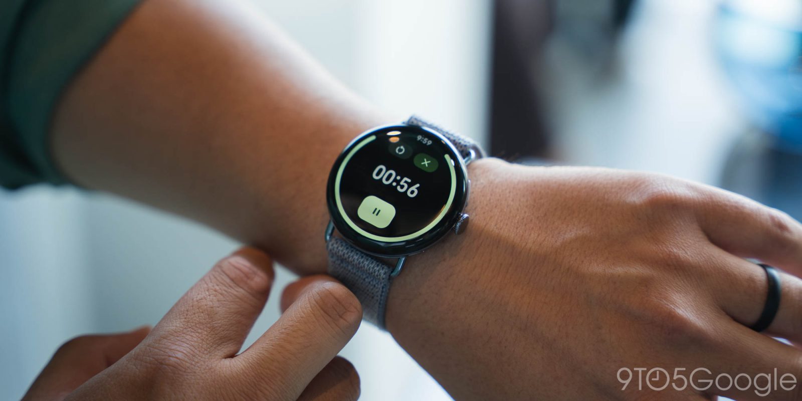
From our Pixel Watch 4 hands-on, the Material 3 Expressive updates to the Google Clock app aren’t major. There are modernizations like buttons being placed in pill-shaped containers and new shapes, as well as the updated font..
On phones, M3 Expressive doesn’t bring new app icons, with this unique to the Wear OS update. Fitbit icons got the same treatment, but other first-party apps are unchanged.


FTC: We use income earning auto affiliate links. More.


