Also in the Month view, the Google Calendar Material 3 Expressive redesign uses the Dynamic Color feature to bring in colors that are prominent in your phone’s wallpaper. Days of the week that need more letters to spell correctly are now abbreviated.
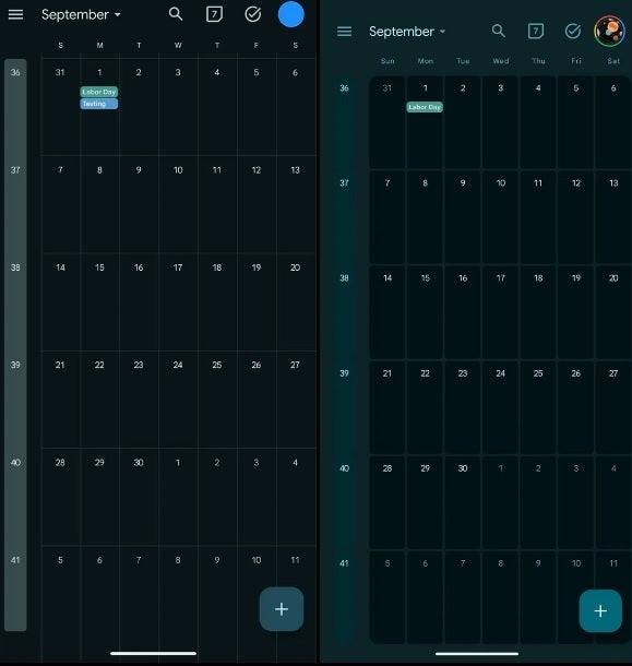
The redesigned Monthly view of Google Calendar on the right. | Image-credit-9to5Google
In the Day view, the redesign adds containers for the time slots. These lines show up better than the thinner, harder-to-view lines used for the version of the Google Calendar app pre-Material 3 Expressive redesign. The background uses a primary shade of Dynamic Color, which is based on the wallpaper on the user’s device.
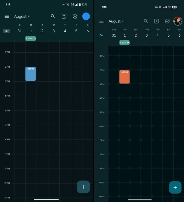
The redesigned Weekly view of Google Calendar on the right. | Image credit-9to5Google
The Agenda View (known as Schedule on the mobile app) has not been changed. This option, which you can access by tapping the hamburger menu icon on the upper left of the screen next to the Month, and tap on Schedule. This shows you your future schedule, including tasks entered into the Google Calendar app. Again, the background hue is based on the Dynamic Color.
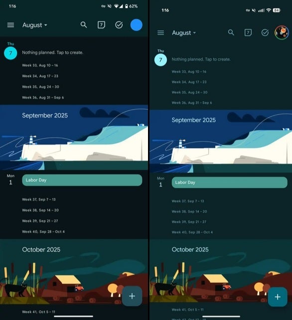
The redesigned Agenda view (aka Schedule in the mobile app) on the right. | Image credit-9to5Google