Hardcore Android users love creating minimalist or themed home screen setups. I’m not one of them — I value function over form.
However, over time, my home screen became unnecessarily cluttered, making it difficult to find the apps I needed quickly.
After being frustrated for the umpteenth time, I finally decided to declutter my Android phone’s home screen for good. Here’s how I achieved this.
The end of my custom launcher era
Stock launcher is the only option now
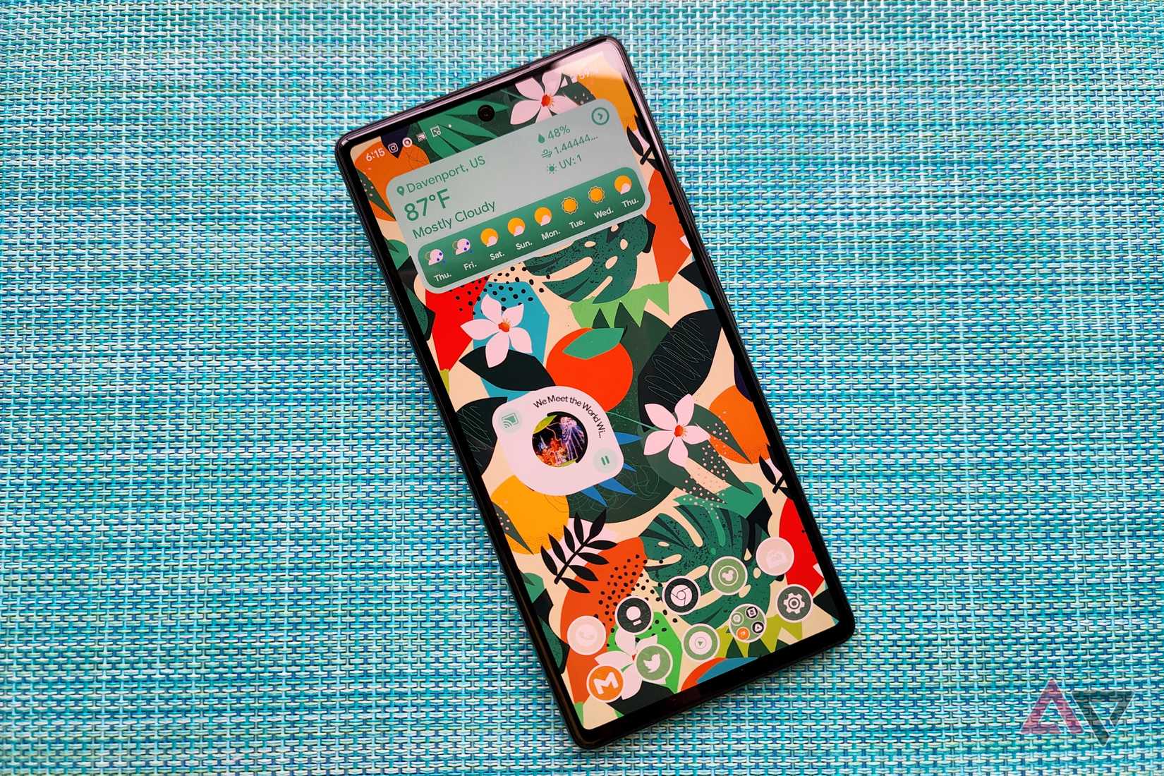
For the longest time, I was a hardcore Nova Launcher user.
I had customized my home screen and set up various gestures that helped me keep my home screen organized, while still keeping everything within easy reach.
Even better, when switching devices, I could create a backup in Nova Launcher and then restore it on another device. This way, I had my home screen set up exactly the way I like it on new devices within seconds.
These days, Android skins no longer play well with custom launchers. Because of this, I’m stuck using the stock launcher on whatever device I use.
Not only do I miss out on gesture controls, but I also can’t restore my home screen backups across devices.
Instead, I have to set up my home screen from scratch every time I switch devices — especially when they’re from different brands.
Over time, this led to my home screen being cluttered and unorganized. My frequently used apps were spread across multiple pages, and finding them became a chore.
With no hopes of Android skins properly supporting custom launchers, I finally decided to take things into my own hands and declutter my home screen.
My step-by-step home screen decluttering plan
Bringing order to chaos

Instead of overhauling my home screen setup all at once, I chose to do it in batches.
As part of the process, I identified the apps I use multiple times a day or almost daily, helping me narrow down which ones deserve a spot on the primary home screen.
The first thing I did to start the decluttering process was to turn off the option that automatically adds shortcuts for newly installed apps.
I frequently come across useful apps on the Play Store and install them for later use. That doesn’t mean I need their shortcut on my home screen.
Depending on your phone, you’ll find this option in the home screen settings.
Second, I decided to limit my home screen setup to two pages and divide it into focus zones.
And since I typically use phones with 6.7-inch or bigger displays, I optimized the layout for one-handed use, putting my most commonly used apps towards the right of the screen, ensuring I can reach them with my thumb.
Two pages, two widgets
Zero clutter
Since I prefer dense home screen layouts, I jumped into the home screen settings of the Xiaomi 15 Ultra’s stock launcher and selected the 5×9 grid size option.
I started by customizing the dock, placing Chrome on the far right, followed by WhatsApp, Slack, X, and Phone. These are my most-used apps, and keeping them on the dock provides quick access.
I also decided to limit myself to two widgets. While there are plenty of useful widgets for Android, I realized I only use one or two regularly.
Given that I rely heavily on Google Calendar to keep track of upcoming events, I added its widget to the top of my primary home screen.
This way, I can quickly check on upcoming events and schedule for the next few days.
To keep things clean, I left the row below the calendar widget empty and placed the Google Search widget below it.
While Google Discover is set as the -1 page on my phone, I still prefer using the search widget for quick access. Plus, it provides quick access to Lens and lets me initiate a voice search with a tap.
To avoid cluttering the home screen with too many app shortcuts, I left a few rows empty. This also lets the stunning wallpapers I use peek through.
So, I kept one row above and below the Google Search widget free of app shortcuts.
Right below, I have two rows of apps I use multiple times a day.
In the first row, the first three icons are Telegram shortcuts to contacts I chat with frequently. I could have just placed a shortcut to the Telegram app, but that would have meant extra taps to get to the conversations.
Next to them is the shortcut for Pixel Search. It brings Pixel Launcher-like system-wide search to other Android devices.
While the app is no longer in active development, it still works and gets the job done. And thanks to it, I rarely need to open the app drawer or place unwanted app shortcuts on the home screen. I can directly search for and open the app I want.
The last shortcut in the second row, on the extreme right, is GPay, which I use multiple times daily to scan QR codes and make payments.
The first row from the bottom has shortcuts for Gmail, Notion, Reddit, Asana, and YT Music — apps that I use at least once a day.
I follow a themed row concept to keep things organized and avoid clutter on the second page of my home screen. Each row is dedicated to specific categories of apps.
At the top, a Todoist widget lets me instantly see my pending and urgent tasks.
After a couple of empty rows, I have a row of shortcuts for apps related to home automation and finance.
Below that, there’s an AI-themed row featuring all the AI apps I use regularly, including ChatGPT, Perplexity, Gemini, Claude, and Canva.
The bottom two rows house shortcuts to several note-taking apps, media-related apps like Camera, Gallery, and Instagram, an RSS reader, Google Maps, Messages, and a few other frequently used tools.
While I could remove most of these shortcuts and rely on Pixel Search to open them, that would mean extra taps.
Instead, I stick to my themed row approach, grouping similar apps to keep everything organized and easy to find.
I can put many of these apps together inside a folder for a cleaner look, but I prefer direct access to these shortcuts.
All function, little flair
While my decluttered home screen might look plain, it’s functional — and that’s what ultimately matters.
It’s also a big improvement over my older setup, which was just rows of unorganized shortcuts spread across multiple pages.
Yes, there’s room for improvement, and the home screen setup won’t likely please minimalist users.
Still, this works for me and ensures I can keep up with my upcoming meetings and events while also getting to apps quickly that I open multiple times every day.


