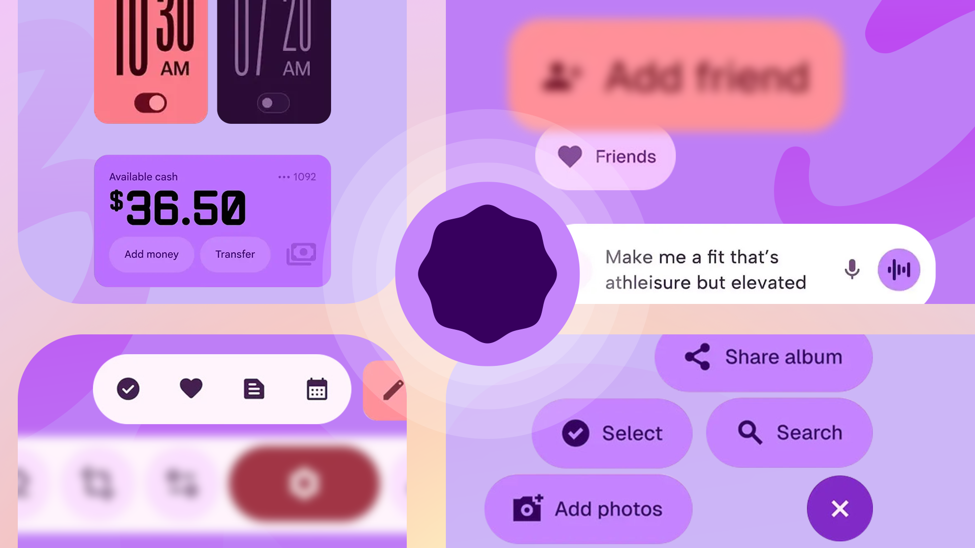
Material 3 Expressive is Google’s new software design language. Meant to bring both a fresh coat of paint and increased usability with an emphasis on subtly drawing your attention to important UI elements, it’s a front-runner for Android 16’s most exciting new feature.
While the OS-side Material 3 Expressive overhaul is set to roll out to Google’s phones later this year with Android 16 QPR1, Google’s fast at work bringing the new design ethos to its many Android apps that don’t require a Pixel or a specific Android version to enjoy. Here are all the Material 3 Expressive app updates we’ve clocked so far.
Related
Material 3 Expressive is getting me excited about Android updates again
Will it land with Android 16?
Chrome
Chrome began getting Material 3 Expressive elements in June, when the Canary build got the option to add colors to entire tab groups. You’ve been able to add colors to help distinguish between tab groups for some time, but previously, these colors only appeared in a small dot icon. Hardly a sweeping redesign, but changes like this tend to roll out in chunks.
Files by Google
Source: Android Authority
In May, Android Authority was able to activate code in the Files by Google app that enabled some new Material 3 Expressive-style elements, including reworked buttons and a new, squiggly progress bar. The majority of the interface was unchanged at the time, but given none of what Android Authority uncovered was meant for a public release anyway, it could still change significantly before it hits a stable release.
Gmail
Image source: SparkRadar on Telegram
Material 3 Expressive changes began rolling out to the Gmail app in early June. The changes have been relatively subtle so far, with bolder use of system colors and rounded corners applied to some UI elements.
Some Material 3 Expressive elements have also been integrated into Gmail’s Wear OS app, with additional color and buttons that curve to hug the edges of round watch displays.
Google
Source: Android Authority
A June APK teardown by Android Authority showed that the Google app was gearing up for some visual tweaks that aren’t especially dramatic, but we’re still chalking them up to the Material 3 Expressive push. The teardown showed a tweaked feed page with a new gradient up top, plus an updated, more rounded progress bar displayed when updating search results.
I’ve got that refreshed header in the Google app on my own device, though the updated progress bar is still MIA.
Google Clock
Source: Android Authority. Old design (1, 2); new design (3, 4).
Google’s shown off a bold, colorful clock app in some of its Material 3 Expressive marketing materials. The existing Google Clock still doesn’t look like what Google’s hinted at, but a couple of weeks ago, it did get a mild expressive refresh that brought bolder text to some UI elements, plus updated toggles that more clearly distinguish between on and off states.
Google Keep
In June, Material 3 Expressive elements began rolling out to Google Keep — on Wear OS. Version 5.25.232.01 of the wearable version of Keep has enabled some new visual elements, including a larger plus (+) button for adding notes and a fun new animation that’s displayed when you tick off all the items on a Keep checklist.
We’re still waiting to see similar changes in the Google Keep phone app.
Google Maps
Source: Android Authority
Google Maps has also picked up some Material 3 Expressive flourishes on Wear OS. In June, the app was spotted showing bolder, more colorful buttons, as well as clearer iconography that’s easier to make out on a watch-size display.
The Android version of Google Maps is yet to adopt Material 3 Expressive design elements.
Google Meet
Old on the left, new on the right. Source: Android Authority
A May APK teardown from Android Authority showed what we can expect in an upcoming Material 3 Expressive refresh. Android enthusiast AssembleDebug was able to enable a version of the app that alters the size and placement of many UI elements, with one particularly notable change being much larger buttons to join and initiate calls.
These changes aren’t yet live, but the UI seems polished, so we could see this design in a stable release any time now.
Google Messages
Source: 9to5Google
Google Messages started getting Material 3 Expressive design elements in early June. Since then, elements within the app have gotten a bolder look, with larger touch targets and bold accent colors more clearly highlighting the options you have selected (as seen in the emoji picker menu in the first screenshot above).
Google Photos
Source: Android Authority
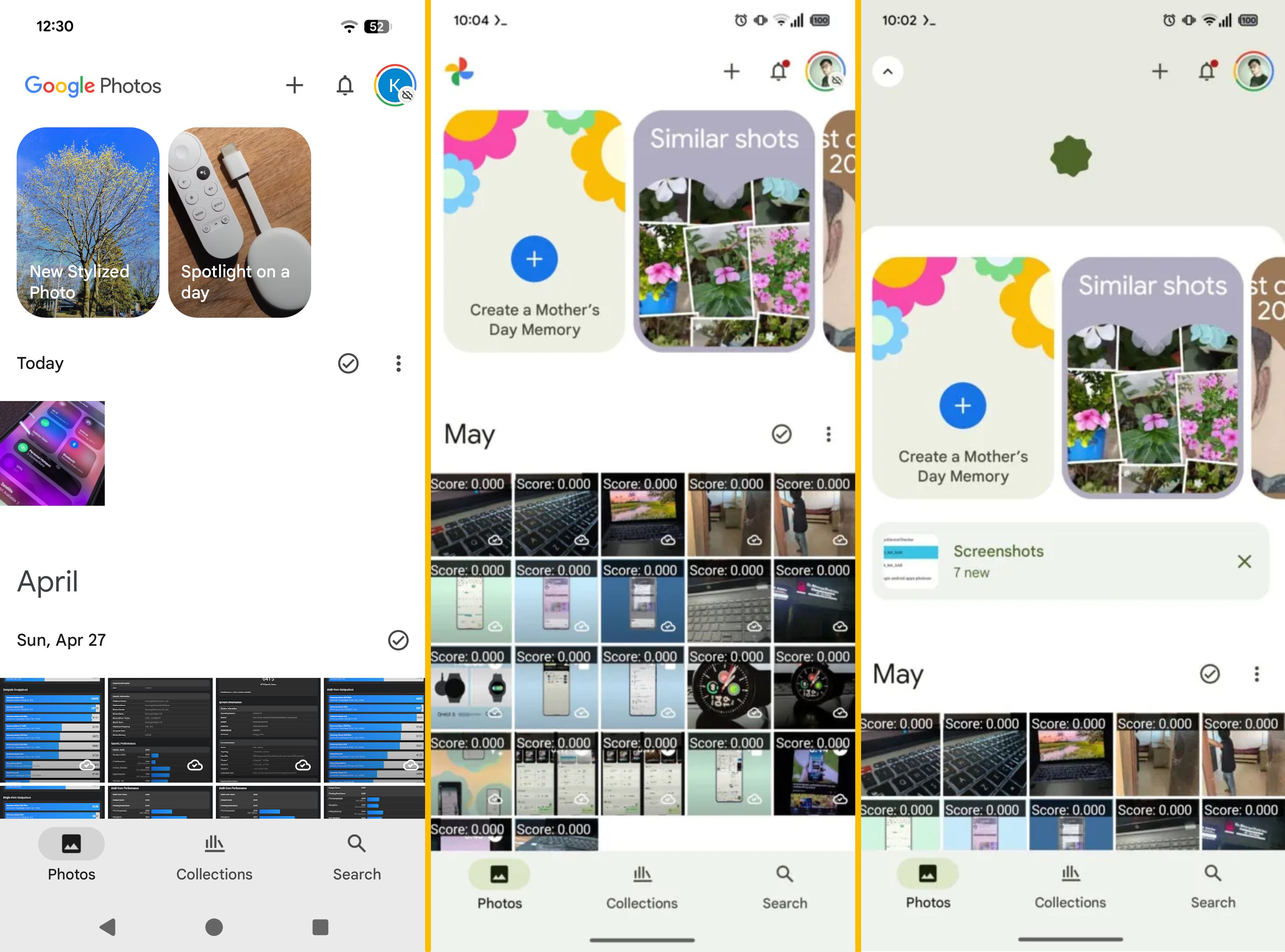
In May, Android Authority was able to enable flags in the Google Photos app that introduced some Material 3 Expressive accents to the app, particularly around the Memories interface at the top of the timeline. In the current Google Photos release, the names assigned to these Memories are overlaid on photos in plain text. In the upcoming redesign, each Memory gets a colored frame.
You can see the differences in the images above; the first screenshot is the app as it is today, the second two are with these new elements enabled. It’s unclear when these changes will officially roll out.
Google Calendar
Google Calendar’s phone app has been updated with Material 3 Expressive style toggles with more visual distinction between their on and off states. It’s a subtle change, but one that’s been consistent across Google’s recent app updates.
In May, an APK teardown by Android Authority showed that the multi-purpose floating action button, or FAB, could soon pick up a new Birthday option that’ll let you quickly add birthdays to your schedule. There’ll also be more subtle tweaks, like bolder text in some fields and the updated Google Sans Flex font applied throughout the UI.
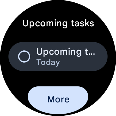
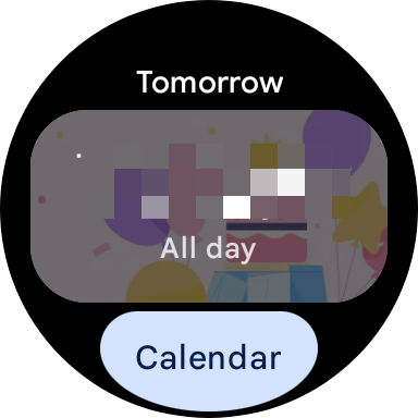
On the Wear OS side, Calendar’s watch tiles have been updated with Material 3 Expressive’s rounded buttons that hug the edges of the display. That update began rolling out in May.
Phone
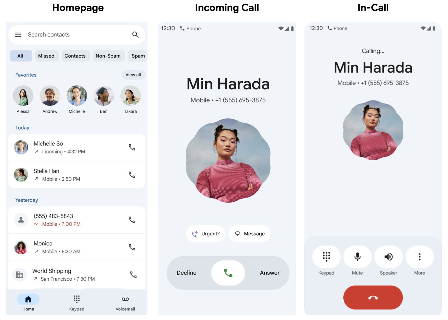
Google officially announced a Material 3 Expressive overhaul of its Phone app on June 23. The update adds a new scalloped border to contact photos during calls, among other visual tweaks. It also tests a new way to answer or decline calls: swiping horizontally, left or right. Google says the change is based on user feedback and is meant to prevent accidental pickups/declines when pulling your phone out of your pocket.
This update is slated to roll out to the Phone app’s beta channel in the near future. Assuming that goes smoothly, we should expect to see the redesign in stable later this year.
Pixel Camera
Source: Android Authority
In June, Android Authority was able to enable some code in the Pixel Camera app that applied a new look in its settings. Again, this is a minor change, bringing the app’s settings screen in line with Android’s system settings in Android 16 QPR1. This change hasn’t rolled out yet, but that AA was able to activate the new look implies it could soon.
Play Store
Source: Leontylerz via Android Authority
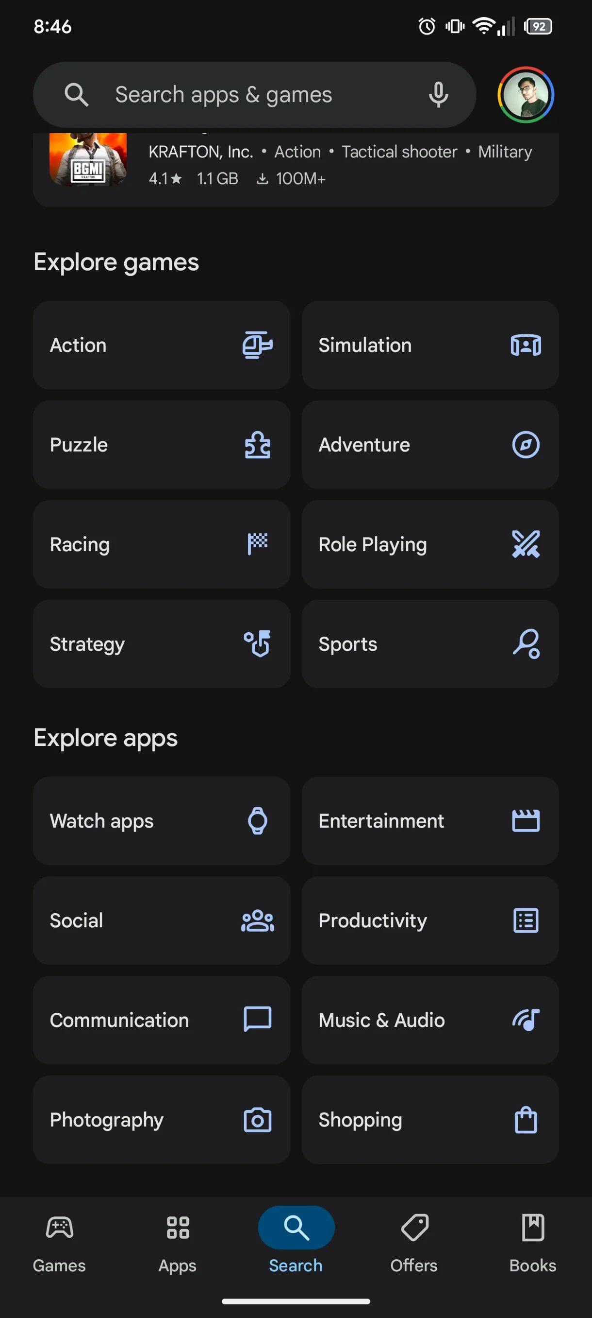
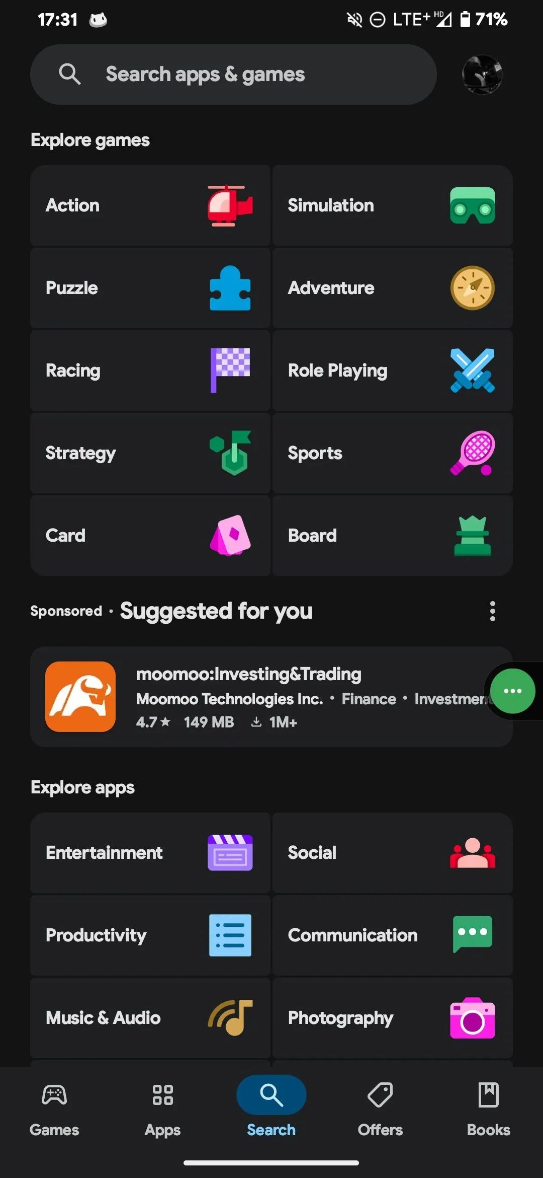
In the middle of June, Telegram user Leontylerz spotted a change in the Play Store app that replaced the search interface’s monochromatic app category icons with larger, more colorful versions that are easier to tell apart. This is in line with Material 3 Expressive’s objective of making UIs easier to parse at a glance.
This change appears to be rolling out gradually; I don’t see it on my own devices yet.
There are plenty of apps to go
That’s a lot of Google apps that have started the transition to Material 3 Expressive, but there’s still a long way to go. There are still major Google apps that haven’t received the expressive treatment — Google Docs, Wallet, YouTube, YouTube Music, and more still don’t feature any Material 3 Expressive elements. Even apps that have begun the transition are doing it in bits and pieces, so there could be more to come for the likes of Google Messages and Clock.

